Interactive Double Pendulum Visualization
Earlier this week I made a couple double pendulum visualizations. One of them showed how long it took a double pendulum to flip given various initial conditions. A couple people were interested in seeing the animations corresponding to certain regions of this plot where the pendulum didn’t flip, so I decided to make an interactive plot. It took me a little bit to put it together but the result is below. Click anywhere in the lower plot to see a double pendulum simulation with the corresponding initial conditions in the upper plot. Zoom and pan using the buttons in the bottom left.
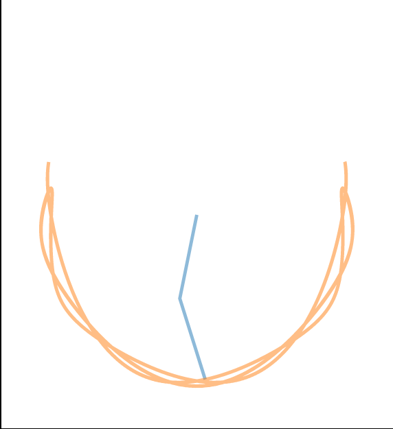
Be sure to check out smaller white and yellow regions surrounded by blue. These correspond to initial conditions where the double pendulum takes a while to flip. In some cases this means the pendulum has entered into a fairly stable orbit. In these regions you will see a single path which repeats:
Angle 1: 0.5867344859865208 Angle 2.8584749256500235
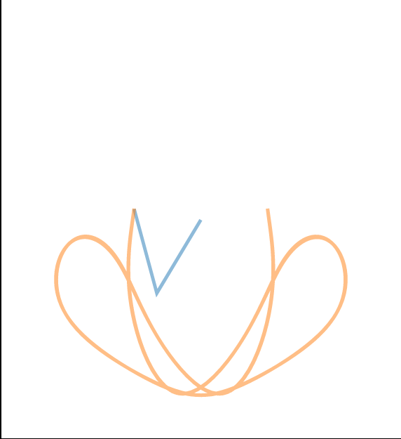
Where as typically you see much more complicated orbits:
Angle 1: 1.62552044812045 Angle 2.015160737889333875
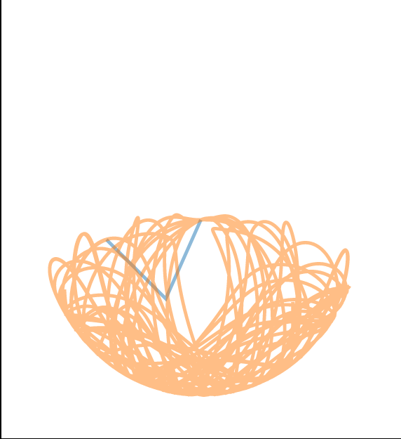
Here are a few other examples I found:
Angle 1: 0.8751064890716895 Angle 2: -2.055322601709835
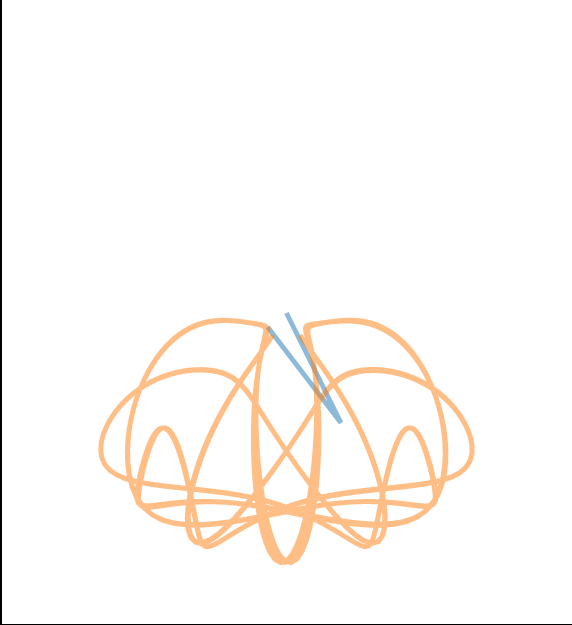
Angle 1: 1.0607292949987075 Angle 2: 1.713767652847776
Angle 1: 1.4455480358016313 Angle 2: 2.6232128076991454
Angle 1: 1.7632522513455844 Angle 2: 2.011205397076557